Chris Coyier's Modern Web Designer's Workflow
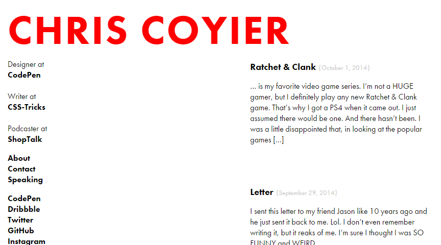
An excellent example of fluid design is shown at Chris Coyier own site http://chriscoyier.net. I can see that he has embraced the concept of content first. His site is simple and un-cluttered with excellent typography.

Simple bold text is shown for links down the left side and these are left justified for neatness. Yes the site has no fancy effects or bright colours, but it does its job well. It’s a Wordpress site, and that might surprise you. Wordpress usually is quite a bulky CMS and can be slow, but Chris has clearly worked his magic (he wrote a book digging into Wordpress to accompany the site http://digwp.com ) as the site loads lightning fast, partly due to minimal images and partly due to the optimisation he has done. As a Wordpress fan, his site gives me real positives about what people say about Wordpress being slow. If Wordpress is done right, it can be used for any site from a hobby site right up to a multi-national corporation. As Chris says in his bio on http://digwp.com/ ‘not only is WordPress capable of powering any website it is almost always the right choice’. I have a renewed love for Wordpress and I have found that there are lots of paid and free responsive Wordpress themes around for when the right project comes along.
