The Mobile Content Mandate
Using multiple devices to access the internet is becoming the norm. Almost every teenager in the first world has a mobile phone or tablet. The interesting thing is mobile access is also becoming popular in the third world too, as cheap smartphones and tablets enable people to access the internet without having to shell out on a full blown PC. This convenient way to access the global internet is only going to grow, with young people being the driving force as they want to be able to keep in contact with friends via email and social networking, access news sites and even use apps for mobile payments.
Mobile web design needs to be thought through more than for the desktop. The interface is usually touch driven rather than mouse driven. The content shown needs to be the most relevant and due to mostly slower mobile internet speeds, content and images need to heavily optimised so loading times are fast.

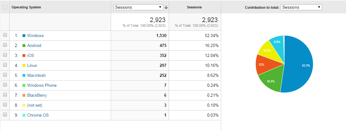
I use Google analytics on my own website as shown above, and was surprised to see these numbers. Although Windows is still the primary device, Android and iOS have overtaken Linux and Mac OS which shows where things are heading. We as developers need to seriously consider ‘Mobile First’ when starting a new web project and also revisit old projects to see if we need to iterate.
